Miscellaneous - The Forgotten Side of Vinyl
by Dave Goodwin
published: 13 / 11 / 2014
intro
In the latest in his 'Vinyl Stories' column David Goodwin reflects on the art of record sleeves
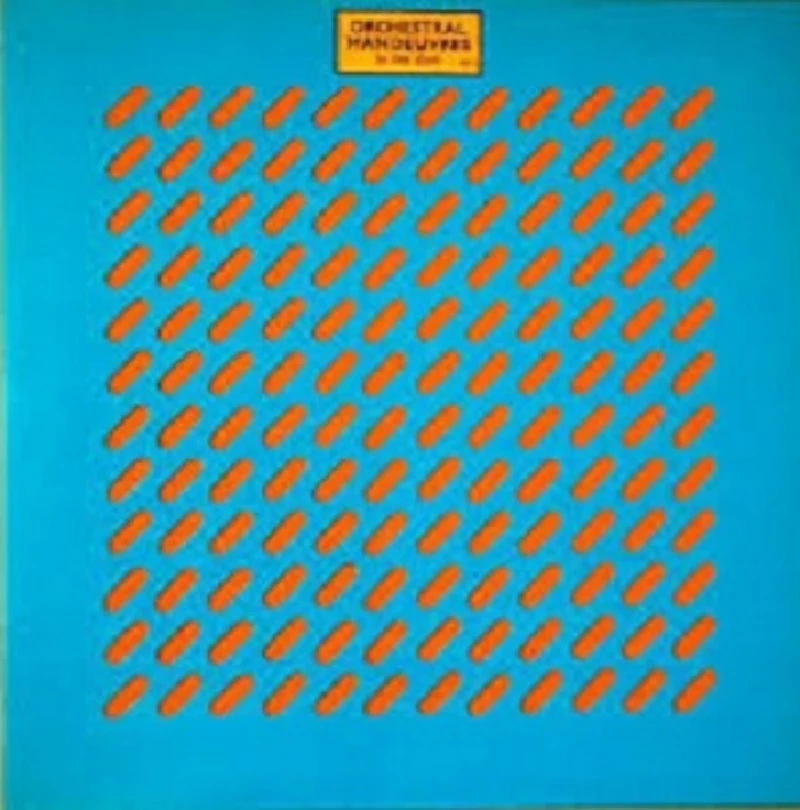
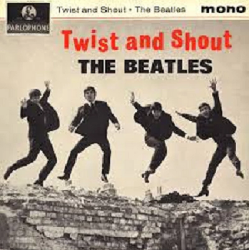
This month's ‘Vinyl Stories’ tackles a side of the record business that is sometimes overlooked, and in the end asks you, the reader, a very serious question. If you consider that every album has a label of which nearly all has had some sort of sign or emblem and also the fact that every album or CD since the dawn of time has some sort of artwork on it, what is your favourite album, single or label image or picture? One of my immense pleasures, which I picked up on as a youth during my bus journeys’ home in the early 1980s, was the artwork that adorned the albums I was buying. I used to scrutinise the cover and even the record itself as I sat down on the top deck of the number 50 or 52 back up to Mapperley Top in Nottingham. Sometimes I nearly missed my stop because I was staring so intensely at the cover. There were times when I would feel 'ripped off' by the album or single because there wasn't much to read on the cover, and I had done it all by the time I got to the Methodist Church which signalled my journey’s end. I remember tripping up sometimes with other albums because there was so much to take in I had to read it whilst walking down the hill to our house. The times when I used to slip into puddles and other times when I totally ignored the next door neighbour shouting “Good Morning!” were all due to my fascination, no, obsession with the black disc. Somehow the albums with no words on them at all, the ones that lead to me feeling 'ripped off', became my favourites. I used to spend hours just analysing the covers to the albums. Some of the covers used to just have one picture on it or just a set of graphics on it, but I could while away the whole day just scanning the content. I can't remember which one it was but I had a record that had a scantily clad female on it that I had to smuggle into the house so my parents couldn't see it. And then came Blondie. Every single had Debbie Harry in next to nothing on it! Bands such as Joy Division would just have one image on them. Of course, I didn't know the name of the picture on my album back then and I didn't have the benefit of the internet to search for the answer. I was a school kid. I did all my school stuff at guess where? School. I wasn't going to spend my valuable weekend time looking up in my parents’ Encyclopaedia Britannica, was I? In fact, yes, I was! I was a proper 'Billy no mates' at times. Especially when I had bought a new piece of music. To go back to Joy Division, the image on the cover was in fact a copy of Bernard Pierre Wolff's photograph of the Appiani family tomb in the Cimitero Monumentale di Staglieno in Genoa, Italy. That's all it had on it, apart from the word 'Closer' on the front at the top and then 'Joy Division' on the back with the Factory Records numbering on the bottom. And then inside it had just a white inner sleeve with a fine black border housing the tracks' names. Not much for my £3.50, was it? But it was mesmerizingly fantastic. What a classic format! My original copy has blu–tack in the corners because I stuck both the cover and the inner sleeve to my bedroom wall. As for the record itself, it was a shiny black disc with a black centre and the Factory ' f' in silver. And that's not all though. The run-out groove had the immortal lines 'Old Blue?' and 'Fact 25 A1'. All of their other records had similar theme. It was this classic artwork that not only added to the sound of bands like Joy Division but made bands like them. Incidentally the 12" cover photo of 'Love Will Tear Us Apart' is a detail of the Ribaudo family tomb in the Staglieno Cemetery in Genova, Italy. Other bands have put a lot of focus on the album cover too. I remember buying a copy of another band’s album who were eventually to go global and end up as arguably one of the best groups the UK has ever produced. Again I studied the sleeve on the bus home and marvelled at its design. This one had holes in it. This was the first example of that kind of cover I had encountered. Staring at the grey sleeve, I ran my fingers over the sleeve and I can remember thinking how cutting edge this was! It had a series of tablet like cut outs going from corner to corner in a square. Showing through the tablet cutouts was a bright luminous orange colour that as you pulled the inner sleeve out disappeared. The orange inner had a black border on two edges, and the track listings were in white italics. Inside further still the black label was covered in the white italics once again, and the run out groove sheltered the words “Go easy on the white noise” and ‘did2”’ on it. The 'b' side had some even more curious words on it in the shape of “The words are on the ceiling”. I remember writing these sayings on my canvas school satchel, thinking that they were “cool”. They must have been quite cool really because all my mates would do the same thing. You might remember the 'V' emblem that adorned the Ultravox album 'Rage in Eden'? Well, one of my mates had drawn an exact copy of that on his which had us all in awe. That album with the holes in was the eponymous debut album of Orchestral Manoeuvres in the Dark, who had numerous links with Joy Division. The 'did2' album number meant that it was the second release from Dindisc. The first single 'Electricity' was released on the Factory label, the same label as Joy Division, and both album covers were designed by Peter Saville who became a partner in Factory Records along with Wilson, Martin Hannett, Rob Gretton and Alan Erasmus. Saville was a major contributor to a lot of the artwork on New Order’s albums too. If you spotted a link between those albums, he also has done work for King Crimson, Roxy Music, Duran Duran, Wham!, Ultravox and Peter Gabriel, to name a few. To go back further in time still, album and single covers were a vital way of giving the fan an idea of what the artist looked like. Nearly every album had a photo of the group on it from the Beatles to the Small Faces to the Who and so on. For many families back then not having a TV, it was a crucial way of letting fans know what their favourite bands looked like. My dad's copy of the Beatles' 'Twist and Shout' was a prime example of this, as was the front of 'Let it Be' and so many others. Of course, a lot of early vinyl didn't have picture sleeves at all, and came in just a factory sleeve with the emblem emblazoned on it. Original factory sleeves are part of the value of some records nowadays. Doo-wop and Northern Soul records are slightly more valuable if they still have their original sleeve. What about 'Nipper' who had his image on nearly all the HMV records and also the iconic UK versions of the Tamla Motown label? The Tamla Motown name itself and the massive 45 that took up around a third of the label became a household name and shot Berry Gordy to stardom. But how many people can name any of his other labels and subsidiaries across the pond? Labels such as Soul, Harvey, VIP and Tri Phi all had their roots in the massive soul music factory that spawned the phrase, “It’s what's in the groove that counts'.” Many of the lesser, smaller labels on the Northern Scene became revered by some music fans, such was the adoration and demand for original vinyl. Labels such as Okeh, Cameo Parkway, ABC, Swan and all those really minute labels that had just one song to their names are now massive in some folks’ eyes. After all, the music, the fashions and the records are for some an actual way of life. The emblems and signs on the records themselves were the artwork of that time. How many UK labels became bigger household names than the artists that made the music? I have, in my life, been blessed with a very patient wife who understands my obsession. Bless her, she has had a torment of a life. She has put up with a lifetime of vinyl being played at all hours of the day. She has had to put up with my endless conversation about when I bought this album or that single or the photo that is on the front of that 45. She has had to put up with years of me staring, still, at my records and the covers that house them. It is an obsession. It's not all about the music. The actual record itself has an immense value to millions of people all over the world. There are people with much bigger and more valuable record collections than mine, and I wonder what their favourite record sleeves are. I have no idea when the first picture sleeve appeared. But let's say it was around the 192os or the 1930s. How many records since then have had a sleeve made for them? How big is that part of the music industry? And considering the vast amounts of records and even CDs since then, which is your favourite?
Also In Vinyl Stories
Ben Phillips (2015)
Bill Wellwood (2023)
British IBM (2020)
Chris Bade (2023)
David Bowie (2016)
David Bowie (2016)
Fiona Hutchings (2017)
Funeral Choices (2024)
Is Vinyl Too Expensive? (2023)
Jed Southgate (2015)
John Rothera (2015)
Jonathan Beckett (2016)
Keith How (2015)
Picture Gallery:-


most viewed articles
current edition
Carl Ewens - David Bowie 1964 to 1982 On Track: Every Album, Every SongArmory Show - Interview with Richard Jobson
Colin Blunstone - Thalia Hall, Chicago, 16/7/2025
John McKay - Interview
Visor Fest - Valencia, Spain, 26/9/2025...27/9/2025
Bathers - Photoscapes 1
Billie Eilish - O2 Arena, London, 10/7/2025
Loft - Interview
Robert Forster - Interview
Sir Tim Rice - Interview
previous editions
Heavenly - P.U.N.K. Girl EPManic Street Preachers - (Gig of a Lifetime) Millennium Stadium, Cardiff, December 1999
Beautiful South - Ten Songs That Made Me Love...
Oasis - Oasis, Earl's Court, London, 1995
Prolapse - Interview
Boomtown Rats - Ten Songs That Made Me Love....
Peter Perrett - In Dreams Begin Responsibilities Interview Part One
Coldplay - Wembley Arena. London, 16/8/2022
Trudie Myerscough-Harris - Interview
Pixies - Ten Songs That Made Me Love...
most viewed reviews
current edition
Davey Woodward - Mumbo in the JumboAmy Macdonald - Is This What You've Been Waiting For?
Sick Man of Europe - The Sick Man of Europe
Phew, Erika Kobayashi,, Dieter Moebius - Radium Girls
Lucy Spraggan - Other Sides of the Moon
Bush - I Beat Loneliness
Suzanne Vega - Flying With Angels
Alice Cooper - The Revenge of Alice Cooper
Blueboy - 2
Cynthia Erivo - I Forgive You
Pennyblackmusic Regular Contributors
Adrian Janes
Amanda J. Window
Andrew Twambley
Anthony Dhanendran
Benjamin Howarth
Cila Warncke
Daniel Cressey
Darren Aston
Dastardly
Dave Goodwin
Denzil Watson
Dominic B. Simpson
Eoghan Lyng
Fiona Hutchings
Harry Sherriff
Helen Tipping
Jamie Rowland
John Clarkson
Julie Cruickshank
Kimberly Bright
Lisa Torem
Maarten Schiethart